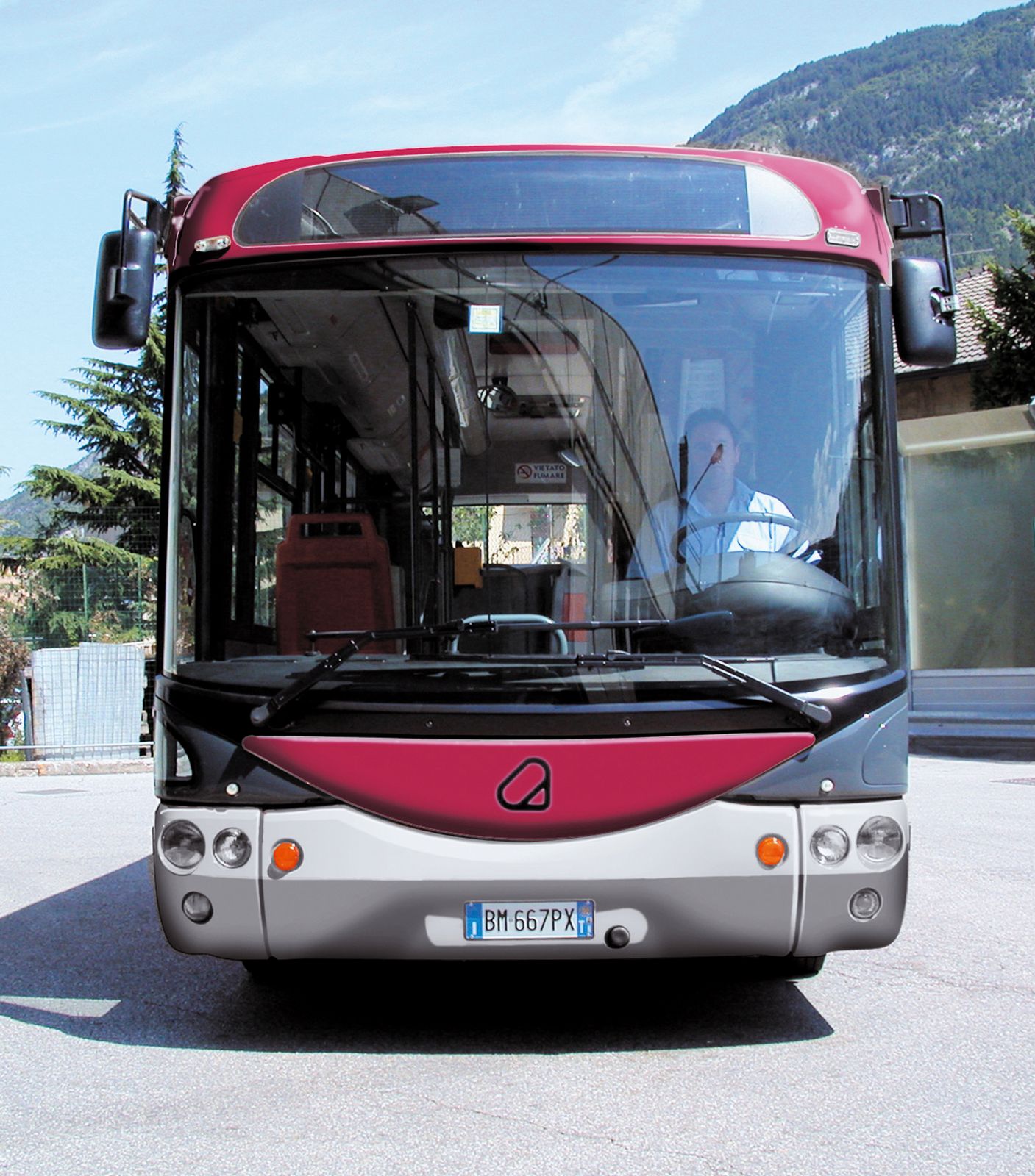
The logo developed for the new company Trentino trasporti born from the merging of Atesina and Ferrovia Trento-Malé.
The logo developed for the new company Trentino trasporti born from the merging of Atesina and Ferrovia Trento-Malé conveys through the stylized brown bear‘s paw the sense of movement and the idea of respect for the natural environment of the region. From the symbol stems the graphics of the new corporate image which highlights dynamism turning the paw’s signs into several coloured intersecting paths.
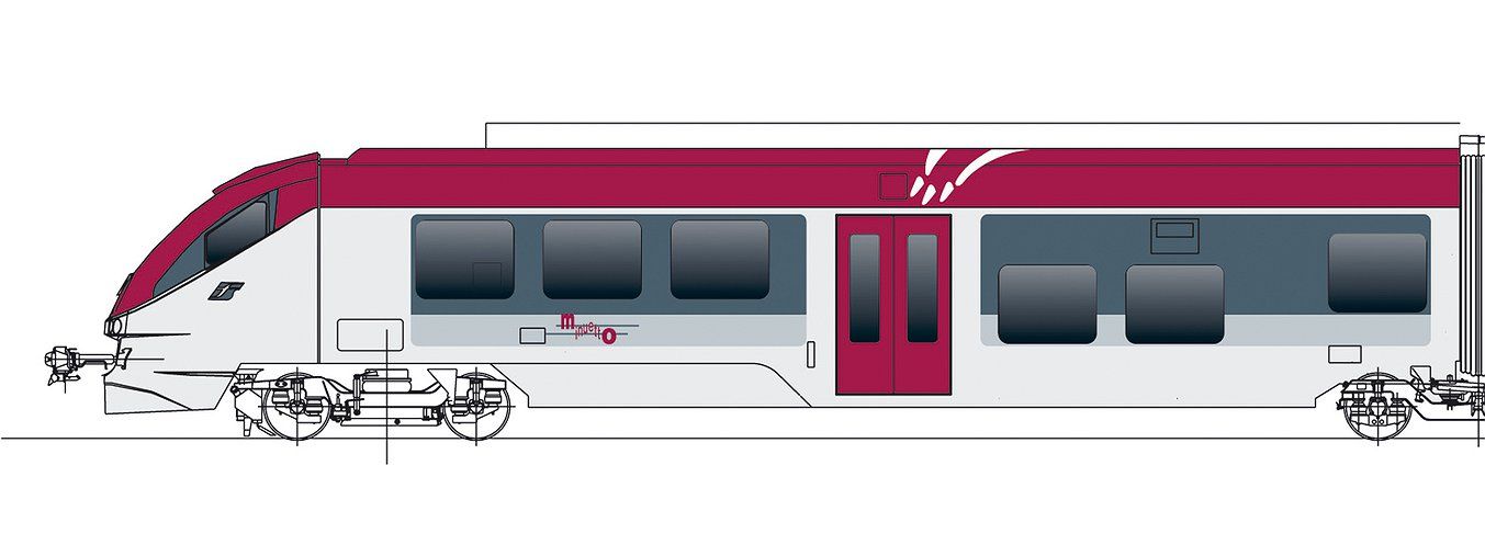
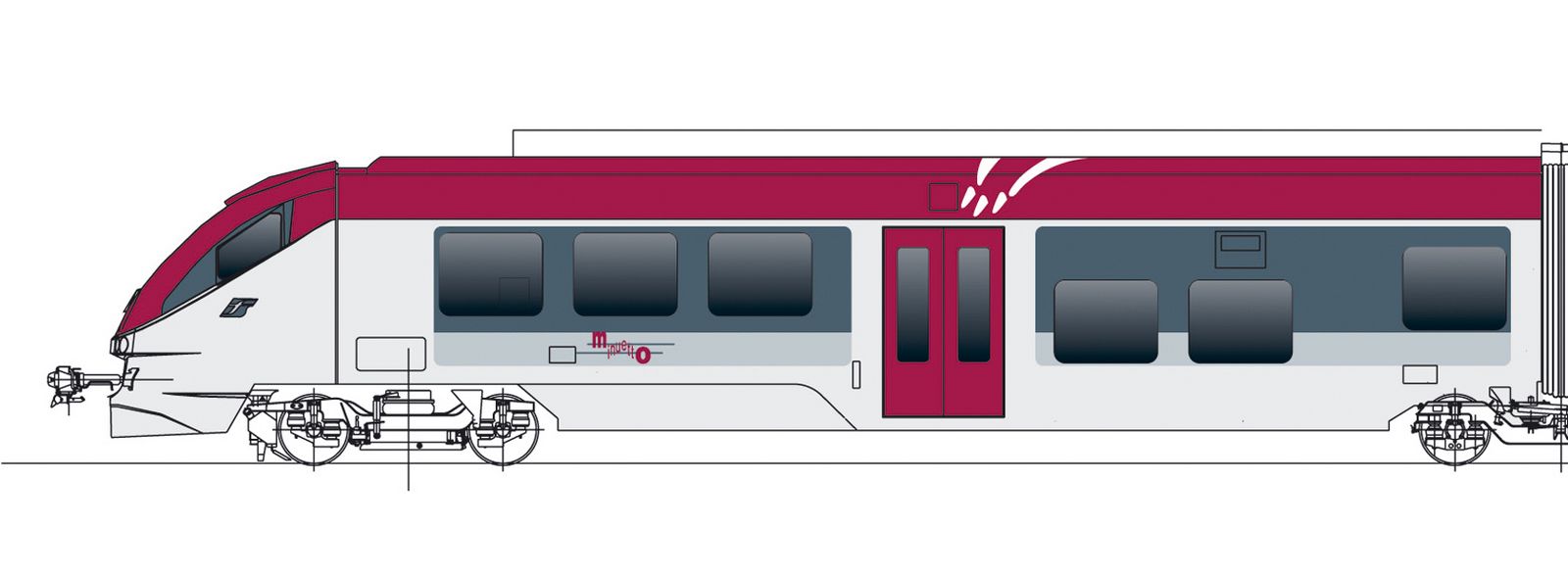
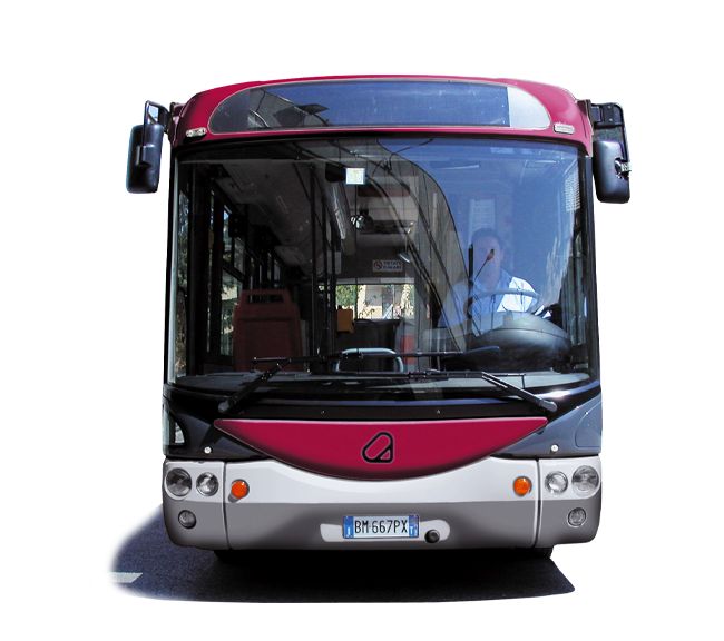
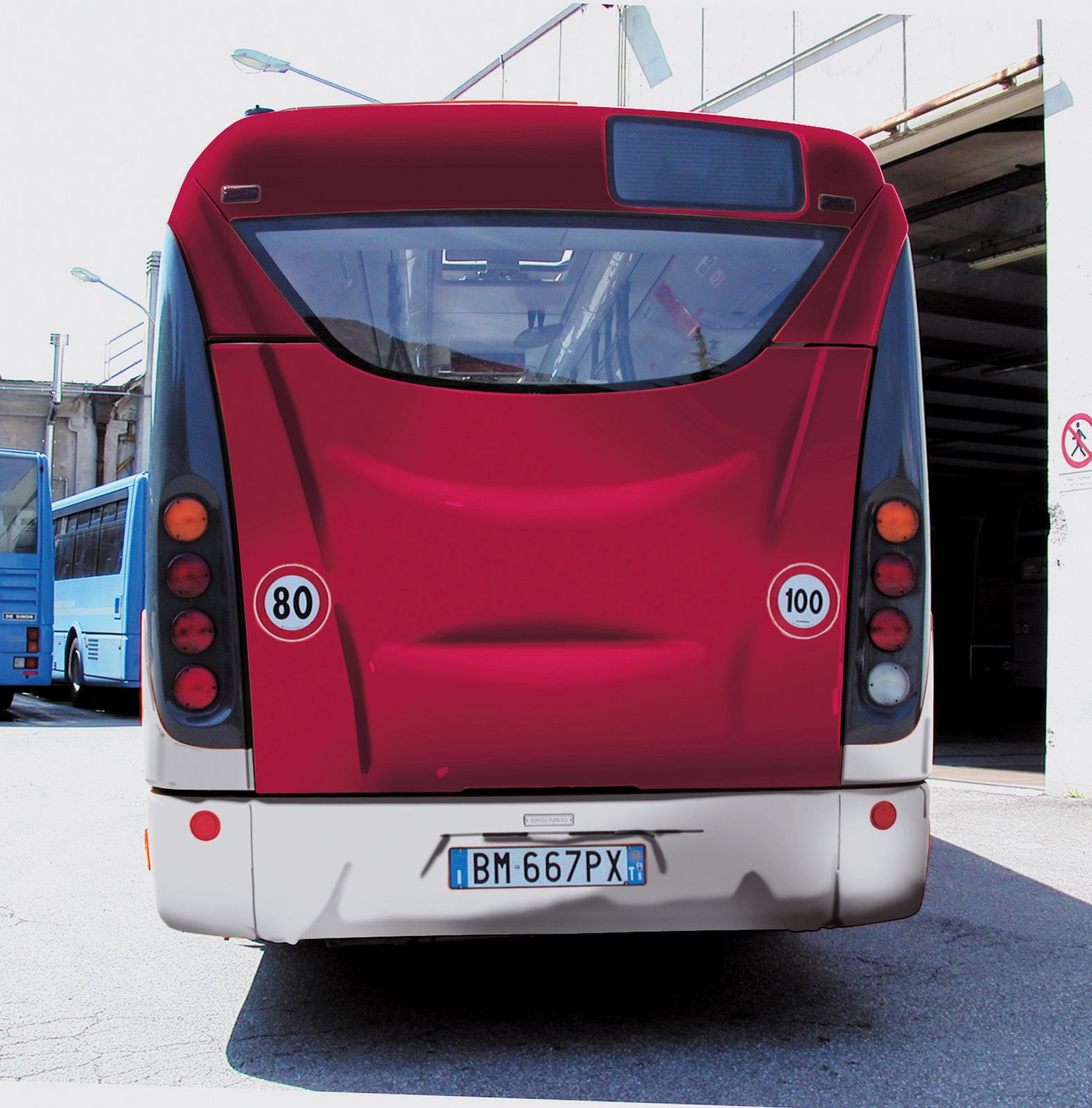
From the same symbol stems the distinguishing mark of means of transportation, poles, shelters: city and extra-urban buses, trains.
The colouring of the bodywork combining the bordeaux red of the Province‘s logo with light grey has been purposely developed for each type of transportation means.
